这不最近我司设计又又给我整活了,甩给我几张炫酷的图表效果图,看得我眼花缭乱;笔者瞅了一眼ECharts常规配置项,果然直接配置是实现不了的。不过没关系,这次正好深入ECharts的renderItem函数,它可以说是ECharts中实现高度自定义图表的”终极武器”。
renderItem
想要实现上述效果,我们首先对echart的renderItem函数有一定的了解;这个函数是Echarts用来实现一些自定义形状(custom series)的核心渲染函数,它可以允许开发者完全控制图形的绘制逻辑,而不仅局限于官方提供的图形;
首先它的使用方式也很简单,将type定义成custom,然后传入renderItem函数就可以了:
| var options = {
series: [
{
type: "custom",
name: "名称",
data: dataArray,
renderItem: function (params, api) {
},
},
],
}
|
对于每一项data数据,都会调用renderItem进行渲染;在最近新发布Echarts6+的特性中,还可以对renderItem函数进行封装注册,在series使用时支持字符串的写法:
| const renderItem = (params, api) => {
return {
}
};
echarts.registerCustomSeries('bubble', renderItem);
var options = {
series: [
{
type: "custom",
name: "名称",
data: dataArray,
renderItem: 'bubble',
},
],
}
|
我们看到,不管函数怎么封装,它接受两个参数,这两个参数对于我们后续绘制图形起着至关重要的作用,我们下面就好好说道说道这个函数。
params
params参数包含了当前数据信息和坐标系的信息,它提供了下面几个属性:
1
2
3
4
5
6
7
8
9
10
11
12
13
14
15
16
17
18
19
20
21
22
23
24
25
26
| {
actionType: null,
context: {},
coordSys: {
type: "cartesian2d",
x: 200,
y: 20,
width: 743,
height: 297
},
dataIndex: 2,
dataIndexInside: 2,
encode: { x: ... y: ... },
seriesId: "",
seriesIndex: 0,
seriesName: "",
}
|
params参数一般配合api中的函数使用。
api
第二个参数比较常用,就是api参数,它是一个CustomSeriesRenderItemAPI类型的对象,上面挂载有很多的函数供开发者调用,主要用来将数据和坐标进行转换使用。
value函数
这么多函数,我们挑选几个重要的函数讲解一下;首先看下value函数,它的作用是取出当前维度dimension的数据值,我们看下实际的案例:
| var options = {
series: [
{
data: [10, 20, 30],
type: "custom",
renderItem: function (params, api) {
console.log(api.value(0))
console.log(api.value(1))
}
}
]
}
|
我们上面模拟了一组简单的数据,api.value(0)获取的是第一个维度的数据,这里数据是一维数组,第一个维度一般是X轴,因此循环输入在X轴上的顺序0,1,2;而api.value(1)获取的是第二个维度的数据,一般是Y轴,因此循环输出对应data的值。
如果我们把数据的维度扩大一个维度,比如散点图会用到二维数组,那么api.value(dimension)就输出对应维度的数据。
1
2
3
4
5
6
7
8
9
10
11
12
13
14
15
16
17
18
| var options = {
series: [
{
data: [
[10, 100],
[20, 200],
[30, 300],
],
type: "custom",
renderItem: function (params, api) {
console.log(api.value(0))
console.log(api.value(1))
}
}
]
}
|
那么聪明的小伙伴可能就会想到了,如果我的数据不是纯数值,而是类似下面的对象数组,那么请问api.value该如何返回?
| var options = {
series: [
{
data: [
{ value: 1048, name: 'Search Engine' },
{ value: 735, name: 'Direct' },
{ value: 580, name: 'Email' },
{ value: 484, name: 'Union Ads' },
{ value: 300, name: 'Video Ads' }
],
}
]
}
|
其实这样的对象数据结构本质上也是一维数组,因此和一维数组的返回是相同的。
coord函数
了解了api.value函数的用法之后,下面就是coord函数,根据名字我们能猜测到,它的作用是定位,不过千万可别小瞧了这个函数,它可是我们下面需要用到的一个最重要的坐标转换函数;它可以将我们value中获取到的数据,转换成画布上的坐标;coord函数的定义如下:
| type Coord = [number, number];
api.coord(
dataValue: Coord | number[],
clamp?: boolean
): Coord;
|
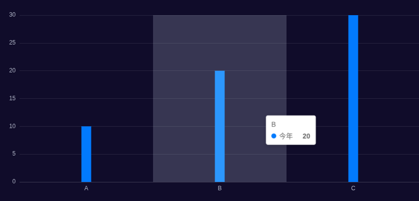
coord函数比较难理解,我们还是通过上面的的例子来具体看下;比如我们根据[10, 20, 30]这样的一个数据,使用自定义图形展示一个柱状图;首先我们需要使用value函数获取x、y轴的值:
| {
renderItem: function (params, api) {
const xValue = api.value(0);
const yValue = api.value(1);
}
}
|
这里对api.value(0)和api.value(1)用法有所疑问的小伙伴可以回到上一节再看一下。
接着使用coord返回数据点所在的x、y坐标以及基准线坐标的坐标:
| {
renderItem: function (params, api) {
const [x, y] = api.coord([xValue, yValue]);
const [x0, y0] = api.coord([xValue, 0]);
}
}
|
这里代码比较抽象,我们知道,在echarts坐标系中,原点的位置在左下角;而在canvas画布坐标系下,原点的位置是位于左上角;但是,而我们在renderItem函数中返回的图形是基于canvas坐标系,coord的定位作用正是将echarts的数据转换为在canvas上的位置,可以说是连接起了两个图形系统的重要桥梁,我们通过一张示意图来更好的理解:
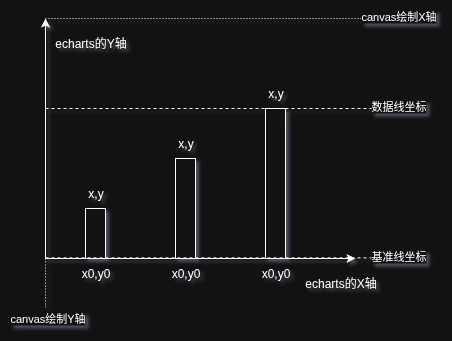
上面获取的[x,y]和[x0,y0]正是我们的数据10,20,30在每次循环调用时转换为canvas下的坐标位置。
理解了coord的作用,我们再来画柱状图就非常简单了:
1
2
3
4
5
6
7
8
9
10
11
12
13
14
15
16
17
18
19
20
21
22
| const boxWidth = 20
{
renderItem: function (params, api) {
return {
type: "rect",
shape: {
x: x - boxWidth / 2,
y,
width: boxWidth,
height: y0 - y,
},
style:{
fill: api.visual("color"),
}
};
}
}
|
这里最终的重要的就是这个高度y0 - y的计算了,相信只要理解了上面坐标转换,这里的计算公式就很好理解,我们看下我们生成的自定义柱状图效果:
visual函数
visual函数用于获取视觉映射结果,它能够将数据值自动映射到颜色、大小、透明度等视觉属性;它的用法如下:
| api.visual(
visualType: 'color' | 'symbol' | 'symbolSize' | 'opacity' | ...,
dataIndex?: number,
payload?: object
);
|
第一个参数是我们想要从数据值中获取的类型,比如上面柱状图中我们就获取了每个柱子的颜色;第二个参数是数据的索引,第三个参数是一个自定义的附加数据。
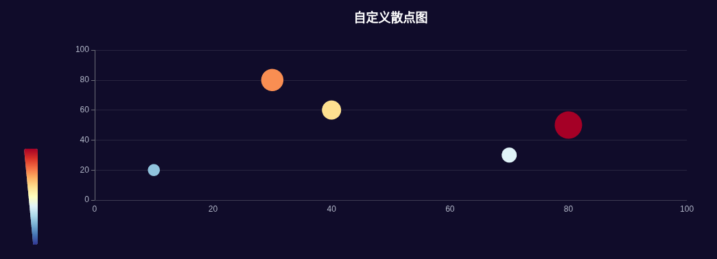
再比如我们在绘制自定义散点图的时候,就可以通过visual函数获取散点的大小和颜色,呈现更好的视觉效果:
1
2
3
4
5
6
7
8
9
10
11
12
13
14
15
16
17
18
19
20
21
22
23
24
25
26
27
28
29
30
31
32
33
34
35
36
37
38
| {
series: [
{
data: [
[10, 20, 5],
[40, 60, 12],
[70, 30, 8],
[80, 50, 20],
[30, 80, 15],
],
type: "custom",
renderItem: function (params, api) {
const xValue = api.value(0);
const yValue = api.value(1);
const [x, y] = api.coord([xValue, yValue]);
const symbolSize = api.visual("symbolSize");
return {
type: "circle",
shape: {
cx: x,
cy: y,
r: symbolSize / 2,
},
style: {
fill: api.visual("color"),
},
};
},
},
],
}
|
我们看效果如下:
返回参数
介绍完api中常用的函数,我们就来看下如何在renderItem中返回图形元素;支持以下多种图形元素:
line(直线)rect(矩形)circle(圆形)ring(圆环)sector(扇形)arc(圆弧)polygon(多边形)path(路径,可绘制任意形状)text(文本)group(组合多个图形)
上面的案例中我们已经返回过了rect矩形和circle圆形两种图形,type属性定义了图形的类型;而shape属性则定义了图形的结构,style属性定义图形的样式,这两种属性在不同图形中差别比较大,我们都可以在官方文档中查到。
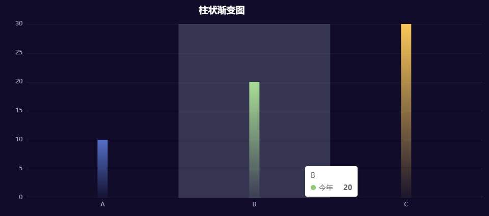
我们可以通过style.fill属性,将上面的柱状图,改写成一个渐变的柱状图:
1
2
3
4
5
6
7
8
9
10
11
12
13
14
15
16
17
18
19
20
21
22
23
24
25
26
27
28
29
30
31
32
33
34
35
36
37
38
39
40
41
42
43
44
45
46
47
|
function createAlphaGradient(baseColor, startAlpha = 1, endAlpha = 0) {
const parsedColor = echarts.color.parse(baseColor);
const startColor = [
parsedColor[0],
parsedColor[1],
parsedColor[2],
startAlpha,
];
const endColor = [
parsedColor[0],
parsedColor[1],
parsedColor[2],
endAlpha,
];
const startColorStr = echarts.color.stringify(startColor, "rgba");
const endColorStr = echarts.color.stringify(endColor, "rgba");
return new echarts.graphic.LinearGradient(0, 0, 0, 1, [
{ offset: 0, color: startColorStr },
{ offset: 1, color: endColorStr },
]);
}
{
renderItem: function (params, api) {
const baseColor = api.visual("color");
const gradientColor = createAlphaGradient(baseColor, 1, 0.05);
return {
style: {
fill: gradientColor,
},
};
},
}
|
上面代码通过visual获取了当前柱子的一个基准颜色baseColor,然后解析这个基准颜色的RGB通道值,再通过createAlphaGradient函数返回graphic.LinearGradient一个渐变效果。
除了图形的属性,renderItem函数还可以返回enterFrom、leaveTo、enterAnimation、leaveAnimation等一系列进入和离开的动画属性,比如我们可以让柱子实现逐个增长的动画效果:
1
2
3
4
5
6
7
8
9
10
11
12
13
14
15
16
17
18
19
| {
renderItem: function (params, api) {
return {
type: "rect",
enterAnimation: {
delay: params.dataIndex * 400,
},
enterFrom: {
shape: {
height: 0,
y: y0,
},
style: {}
},
}
}
}
|
这里添加了enterFrom属性,这个属性用于实现入场动画;shape里面可以放各种图形的属性,style属性添加入场前的样式,例如在style中添加color、opacity等,我们看下效果:

我们可以访问这个页面查看效果
除了基础的元素,我们还可以将多元素组合后,返回一个group,这样就可以组合成更复杂的图形了;下面就是我们今天要实现的三个案例:折线装饰旋转元素、分隔渐变柱状图和立体渐变柱状图。
折线装饰旋转元素
我们想要在折线图上添加一些下面的装饰旋转元素:
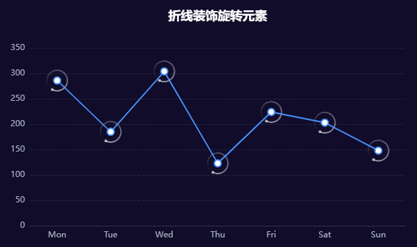
首先我们发现这个装饰元素整体可以分成两个部分,一个大的圆点,后面拖着一个渐变的圆弧;大的圆点好实现,通过circle绘制即可,我们首先在group中添加一个circle:
1
2
3
4
5
6
7
8
9
10
11
12
13
14
15
16
17
18
19
20
21
22
23
24
25
26
27
| {
renderItem: function (params, api) {
const xValue = api.value(0);
const yValue = api.value(1);
const [x, y] = api.coord([xValue, yValue]);
return {
type: "group",
x,
y,
children: [
{
type: "circle",
shape: {
cx: -15,
cy: 0,
r: 2,
},
style: {
fill: "rgba(255,255,255,0.6)",
},
},
]
}
}
}
|
接着我们来绘制圆环,经过在官方文档组件的一通查找后,发现了一个名为arc的图形元素,我们通过stroke属性给它一个线性的渐变效果:
1
2
3
4
5
6
7
8
9
10
11
12
13
14
15
16
17
18
19
20
21
22
23
24
25
26
27
28
29
30
31
32
33
34
35
36
37
38
39
40
| {
renderItem: function (params, api) {
return {
type: "group",
x,
y,
children: [
{
type: "arc",
shape: {
cx: 0,
cy: 0,
r: 15,
r0: 10,
startAngle: 0,
endAngle: Math.PI * 2,
},
style: {
stroke: {
type: "linear",
colorStops: [
{
offset: 0,
color: "rgba(255,255,255,1)",
},
{
offset: 1,
color: "rgba(255,255,255,0)",
},
],
},
lineWidth: 2,
fill: "transparent",
},
},
]
}
}
}
|
我们看到arc元素的圆环渐变效果是在整体圆环上的从左到右渐变,而不是我们想要沿着整个圆环的渐变效果:

俗话说得好,既然一个圆环不行,那就给他来两个;我们把圆环分割成上下两个部分,每个部分分别使用线性渐变:
1
2
3
4
5
6
7
8
9
10
11
12
13
14
15
16
17
18
19
20
21
22
23
24
25
26
27
28
29
30
31
32
33
34
35
36
37
38
39
40
41
42
43
44
45
46
| {
children: [
{
type: "arc",
shape: {
startAngle: 0,
endAngle: Math.PI,
},
style: {
colorStops: [
{
offset: 0,
color: "rgba(255,255,255,0.6)",
},
{
offset: 1,
color: "rgba(255,255,255,0.3)",
},
],
},
},
{
type: "arc",
rotation: Math.PI,
shape: {
startAngle: 0,
endAngle: Math.PI,
},
style: {
colorStops: [
{
offset: 0,
color: "rgba(255,255,255,0.3)",
},
{
offset: 1,
color: "rgba(255,255,255,0)",
},
],
},
},
]
}
|
这样就能达到我们想要的效果了:
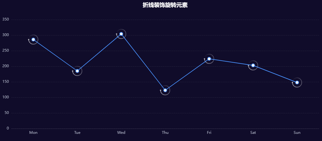
图形上的元素已经基本绘制完成了,下面我们就来让group元素旋转起来;在renderItem的返回属性中还有一个keyframeAnimation属性可以用来配置动画
1
2
3
4
5
6
7
8
9
10
11
12
13
14
15
16
17
18
19
20
21
22
23
24
25
26
27
28
29
30
31
32
33
| {
renderItem: function (params, api) {
return {
type: "group",
x,
y,
keyframeAnimation: {
duration: 2000,
easing: 'linear'
loop: true,
keyframes: [
{
percent: 0,
rotation: 0,
},
{
percent: 0.5,
rotation: -Math.PI,
},
{
percent: 1,
rotation: -Math.PI * 2,
},
],
},
}
}
}
|
keyframes数组每一项为一个关键帧,它的第一个必选属性是percent,表示该关键帧的百分比,取值范围是0-1;其它属性为图形在这个关键帧的属性,例如位置x,y,样式style和shape等等;这样我们就实现了元素的旋转动画。
我们可以访问这个页面查看效果
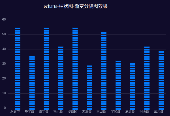
分隔渐变柱状图
下面就是本文要实现的重点:分隔渐变柱状图,我们看下最后达到的效果:
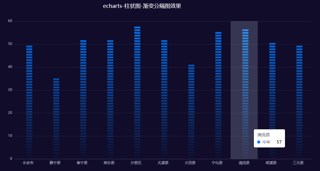
回顾我们上面已经实现的渐变柱状图,我们发现分隔渐变柱状图,就是将一根柱子拆分成多个方块呈现出来,每个方块的颜色都在像着更浅的颜色变化;因此这个图的难度其实在于如何计算出当前index所对应小方块的颜色和方块所在y轴位置。
我们先把小方块的基础信息都定义出来,比如宽高以及格子间的间距等数据:
1
2
3
4
5
6
7
8
9
10
11
12
13
14
15
16
17
18
19
20
21
22
23
24
25
26
27
28
29
30
31
32
33
34
35
36
37
38
39
40
41
42
43
44
45
| {
renderItem: function (params, api) {
const xValue = api.value(0);
const yValue = api.value(1);
const [x, y] = api.coord([xValue, yValue]);
const [x0, y0] = api.coord([xValue, 0]);
const totalHeight = y0 - y;
const gap = 3;
const width = 20;
const height = 6;
const count = Math.round(totalHeight / (height + gap));
const baseColor = api.visual("color");
const rects = Array.from({ length: count }, (_, index) => {
const realHeight = y0 - (height + gap) * index;
return {
type: "rect",
shape: {
x: x,
y: realHeight,
width,
height,
},
style: {
fill: baseColor,
},
};
});
return {
type: "group",
x: 0,
y: 0,
children: rects,
};
},
}
|
这里我们把height+gap看作是一整个格子的高度;先通过基准线yo减去数据y的坐标,获取整个柱子的高度totalHeight;然后通过totalHeight可以计算整个柱子所需的小方块数量count。
然后循环count,来生成每一个小方块;每一个小方块的y轴位置计算,从基准线开始向上计算,公式为realHeight = y0 - (height + gap) * index;我们看下最后的效果:
我们发现由于api.coord([xValue, yValue])获取的数据坐标的x轴是在中心,因此我们需要将x的位置减去二分之一的柱子宽度width;而下面第一个方块也超出了基准线y0的高度,我们为了让最后一个方块底部贴着基准线,我们将柱子整体往上偏移一个小方块height的高度:
|
const rects = Array.from({ length: count }, (_, index) => {
const realHeight = y0 - (height + gap) * index;
return {
type: "rect",
shape: {
x: x - width / 2,
y: realHeight - height,
},
};
});
|
这样修复柱子的x、y位置后,柱子就在整个空间的中间位置;下面我们再给每个小方块一个动画效果,让小方块刚开始宽度高度都为0,从中心开始,挨个的增长出来。
这里我们不设置width、height为0,而是通过scaleX和scaleY在X、Y轴上的缩放;这是因为通过缩放,我们可以控制缩放的中心点在小方块的中间:
1
2
3
4
5
6
7
8
9
10
11
12
13
14
15
16
17
18
19
20
21
22
23
| const realHeight = y0 - (height + gap) * index;
return {
type: "rect",
scaleX: 1,
scaleY: 1,
opacity: 1,
originX: x0,
originY: realHeight - height / 2,
shape: {
x: x - width / 2,
y: realHeight - height,
width,
height,
},
enterFrom: {
scaleX: 0,
scaleY: 0,
style: { opacity: 0 },
},
enterAnimation: {
delay: 20 * index,
},
};
|
我们还是通过enterFrom属性设置每个小方块进入时的状态,XY方向缩放都为0,透明度也为0;缩放中心点的设置上,originX设置为x0就是小方块的X轴中心;而我们上面Y轴向上偏移了height绘制了方块,因此originY设置为realHeight - height / 2即为Y轴中心;这样我们缩放的动画也设置好了。
渐变颜色
每个小方块的形状和位置确定后,我们下面就需要给它们来“涂颜色”了;我们在上面获取到每个柱子的基础颜色baseColor,一般是一个十六进制的颜色值,我们需要计算得到柱子底部的颜色,是一个rgba的色值,例如:rgba(255, 255, 255, 0.1);我们先实现两个色值转换的工具函数:
1
2
3
4
5
6
7
8
9
10
11
12
13
14
15
16
17
18
19
20
21
22
23
24
25
26
27
28
29
30
31
32
33
34
35
36
37
38
39
40
|
export function hexToRgb(hex: string): number[] {
let str = hex.replace("#", "");
if (str.length === 8) {
str = str.substring(0, 6);
}
if (str.length % 3) {
return [];
}
let count = str.length / 3;
let power = 6 / str.length;
let r = parseInt("0x" + str.substring(0 * count, 1 * count)) ** power;
let g = parseInt("0x" + str.substring(1 * count, 2 * count)) ** power;
let b = parseInt("0x" + str.substring(2 * count)) ** power;
return [r, g, b];
}
export function alphaBlend(colorStr: string, alpha: number): string {
const colorArr = hexToRgb(colorStr);
if (!colorArr.length) {
return "";
}
const [r, g, b] = colorArr;
return `rgba(${r},${g},${b},${alpha})`;
}
|
hexToRgb函数是一个色值转换函数,而alphaBlend则是我们需要用到的将baseColor转为最终颜色的函数:
|
const baseColor = api.visual("color");
const endColor = alphaBlend(baseColor as string, 0);
|
起点和终点的颜色确定了,在循环count函数时,我们就可以根据这两个颜色来确定方块的颜色了;为了让每个小方块在相同高度有相同的渐变颜色,我们还需要用到api中的一个函数api.getHeight,它的作用是获取整个echarts容器的高度。
| const rects = Array.from({ length: count }, (_, index) => {
const realHeight = y0 - (height + gap) * index;
const fill = liftColor(
baseColor,
endColor,
realHeight / api.getHeight()
);
return {
type: "rect",
style: {
fill,
},
};
});
|
这里我们使用一个liftColor函数,它接受三个参数,baseColor和endColor作为起点和终点的颜色,第三个参数是在两个颜色中间的过渡比例,我们使用柱子当前高度realHeight除以容器的总高度作为比例,这样在相同的高度就可以保持一致;最后我们就能看到最后的实现效果如下:
我们可以访问这个页面查看效果
立体渐变柱状图
我们先来看下立体渐变柱状图的实现效果如下:
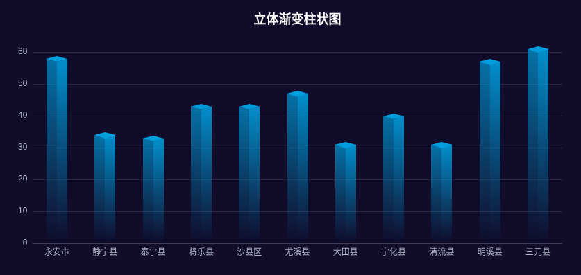
我们发现,这个立体柱状图其实是一个2.5D的立体,相比于普通一维的柱状图,它是由左右两个梯形和顶部的菱形拼接而成;而这三种形状官方文档中都是没有提供的,因此我们需要通过graphic.registerShape来注册新的图形绘制函数:
1
2
3
4
5
6
7
8
9
10
11
12
13
14
15
16
17
18
19
20
21
22
23
24
25
26
27
28
29
30
31
32
33
34
35
36
37
38
39
40
41
42
43
44
45
46
47
48
49
50
51
52
53
54
55
56
57
58
59
60
61
62
63
64
65
66
67
68
|
const leftShape = graphic.extendShape({
buildPath(ctx, shape) {
const { topBasicsYAxis, bottomYAxis, basicsXAxis } = shape
const WIDTH = 15
const OBLIQUE_ANGLE_HEIGHT = 4
const p1 = [Math.round(basicsXAxis - WIDTH), Math.round(topBasicsYAxis - OBLIQUE_ANGLE_HEIGHT)]
const p2 = [Math.round(basicsXAxis - WIDTH), Math.round(bottomYAxis)]
const p3 = [Math.round(basicsXAxis), Math.round(bottomYAxis)]
const p4 = [Math.round(basicsXAxis), Math.round(topBasicsYAxis)]
ctx.moveTo(p1[0], p1[1])
ctx.lineTo(p2[0], p2[1])
ctx.lineTo(p3[0], p3[1])
ctx.lineTo(p4[0], p4[1])
ctx.closePath()
},
})
const rightShape = graphic.extendShape({
buildPath(ctx, shape) {
const { topBasicsYAxis, bottomYAxis, basicsXAxis } = shape
const WIDTH = 15
const OBLIQUE_ANGLE_HEIGHT = 4
const p1 = [Math.round(basicsXAxis), Math.round(topBasicsYAxis)]
const p2 = [Math.round(basicsXAxis), Math.round(bottomYAxis)]
const p3 = [Math.round(basicsXAxis + WIDTH), Math.round(bottomYAxis)]
const p4 = [Math.round(basicsXAxis + WIDTH), Math.round(topBasicsYAxis - OBLIQUE_ANGLE_HEIGHT)]
ctx.moveTo(p1[0], p1[1])
ctx.lineTo(p2[0], p2[1])
ctx.lineTo(p3[0], p3[1])
ctx.lineTo(p4[0], p4[1])
ctx.closePath()
},
})
const topShape = graphic.extendShape({
buildPath(ctx, shape) {
const { topBasicsYAxis, basicsXAxis } = shape
const WIDTH = 15
const OBLIQUE_ANGLE_HEIGHT = 4
const p1 = [Math.round(basicsXAxis), Math.round(topBasicsYAxis + 0.5)]
const p2 = [Math.round(basicsXAxis + WIDTH + 0.5), Math.round(topBasicsYAxis - OBLIQUE_ANGLE_HEIGHT)]
const p3 = [Math.round(basicsXAxis), Math.round(topBasicsYAxis - OBLIQUE_ANGLE_HEIGHT * 2)]
const p4 = [Math.round(basicsXAxis - WIDTH - 0.5), Math.round(topBasicsYAxis - OBLIQUE_ANGLE_HEIGHT)]
ctx.moveTo(p1[0], p1[1])
ctx.lineTo(p2[0], p2[1])
ctx.lineTo(p3[0], p3[1])
ctx.lineTo(p4[0], p4[1])
ctx.closePath()
},
})
graphic.registerShape("leftShape", leftShape)
graphic.registerShape("rightShape", rightShape)
graphic.registerShape("topShape", topShape)
|
这里ctx就是canvas的上下文,我们可以用它来绘制;shape是传入的图形数据,这里都是一些canvas的语法,不再赘述了。
下面就是我们熟悉的renderItem函数了,在type中使用registerShape中注册的图形名称,传入shape的数据:
1
2
3
4
5
6
7
8
9
10
11
12
13
14
15
16
17
18
19
20
21
22
23
24
25
26
27
28
29
30
31
32
33
34
35
36
37
38
39
40
41
42
43
44
45
46
47
48
49
50
51
| {
renderItem: function (params, api) {
const xValue = api.value(0)
const yValue = api.value(1)
const [x, y] = api.coord([xValue, yValue])
const [x0, y0] = api.coord([xValue, 0])
const baseColor = api.visual("color") as string
return {
type: "group",
children: [
{
type: "leftShape",
shape: {
topBasicsYAxis: y,
basicsXAxis: x,
bottomYAxis: y0,
},
style: {
fill: reateAlphaGradient(baseColor, 1, 0),
},
},
{
type: "rightShape",
shape: {
topBasicsYAxis: y,
basicsXAxis: x,
bottomYAxis: y0,
},
style: {
fill: createAlphaGradient(baseColor, 1, 0),
},
},
{
type: "topShape",
shape: {
topBasicsYAxis: y,
basicsXAxis: x,
bottomYAxis: y0,
},
style: {
fill: baseColor,
},
},
],
}
},
}
|
这样我们就得到了一个由三个图形拼接而成的渐变柱状图:
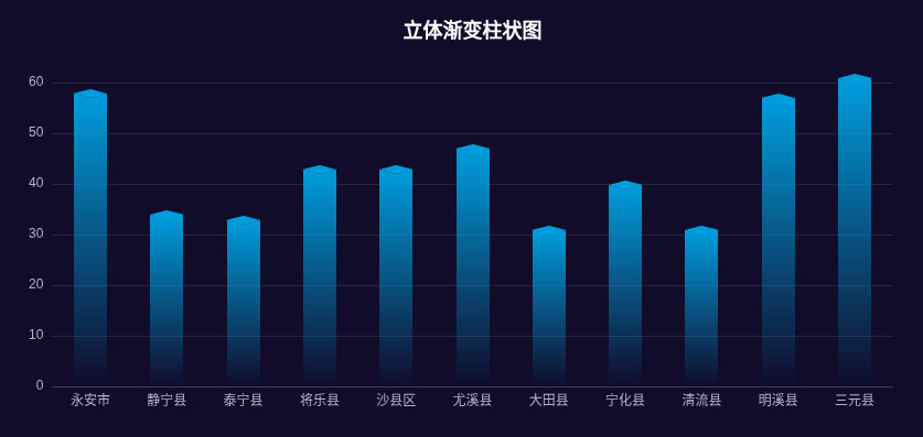
为了让图形更有立体的效果,我们让下面两个梯形的颜色透明度更低一点:
| {
type: "leftShape",
style: {
fill: createAlphaGradient(baseColor, 0.7, 0),
},
}
{
type: "rightShape",
style: {
fill: createAlphaGradient(baseColor, 0.9, 0),
},
}
|
这样我们就实现了立体渐变柱状图的整体效果,我们可以访问这个页面查看效果
总结
本文详细介绍了renderItem函数如何创建自定义的图表;首先解释renderItem函数的基本用法和参数结构,包括params对象提供的上下文信息、api中的关键函数(value函数、coord函数、visual函数等);主要的难点就在于理解在函数中如何数据值转换为视觉属性,以及如何组合基本图形元素来构建复杂的自定义图表。
本文重点介绍了三个高级案例的实现:折线装饰旋转元素通过组合圆形和圆弧创建动态旋转效果;分隔渐变柱状图将单个柱子分解为多个渐变色块;立体渐变柱状图则通过注册自定义形状创建2.5D立体效果。
这三个案例显示了renderItem强大的灵活性,让我们能够开发出超过Echarts内置的图表类型,创造出高度定制化的数据可视化效果。
本文所有代码敬请关注公众号【前端壹读】,后台回复关键词【Echarts高级开发】即可获取。
参考
echarts - 自定义形状 - 实现立体柱状图
通过Echarts怎样实现立体柱状图