在上一篇文章中我们在安卓和iOS环境下分别都配置好了RN的开发环境,初步搭建了项目并且进行调试;这一章中我们正式进入代码环节,先从APP的样式布局开始,学习在移动端是如何来编写样式的,以及和Web端之间的区别。
一款好的APP离不开一个优雅的样式和合理的布局;在移动端,用户的注意力都集中在手掌大小的屏幕上,因此如果样式稍微有点瑕疵,很容易就影响美观,以及用户体验。而且移动端的组件都布局在相对较小的画布上,由于页面复杂,同时移动端设备尺寸众多,因此合理的页面布局就显得十分重要了。
CSS样式
在React Native中编写css样式和在网页中编写样式没有太大的不同,遵循了web上的css命名,不过按照JS的语法由中划线改为了小驼峰的形式,比如background-color我们在RN中需要写成backgroundColor。
所有的核心组件接收style样式属性,它是一个普通的css对象:
| <View>
<View style={{width: 50, height: 50, backgroundColor: 'powderblue'}} />
<View style={{width: 100, height: 100, backgroundColor: 'skyblue'}} />
<View style={{width: 320, height: 150, backgroundColor: 'steelblue'}} />
</View>
|
在实际开发中样式会越来越庞大复杂,这样写的行内样式不利于复用和维护,我们使用StyleSheet.create来创建样式表:
1
2
3
4
5
6
7
8
9
10
11
12
13
14
15
16
17
18
19
| import React from 'react';
import { StyleSheet, Text, View } from 'react-native';
const Home = ()=>{
return (
<View>
<View style={styles.box1} />
<View style={styles.box2} />
<View style={styles.box3} />
</View>
)
}
const styles = StyleSheet.create({
base: {fontSize: 20},
box1: {width: 50, height: 50, backgroundColor: 'powderblue'},
box2: {width: 100, height: 100, backgroundColor: 'skyblue'},
box3: {width: 320, height: 150, backgroundColor: 'steelblue'},
red: {backgroundColor: 'red'},
});
export default Home
|
style属性也可以接收一个数组,接收样式列表:
| <View>
<View style={[styles.box1, styles.base, styles.blue]} />
<View style={styles.box2} />
<View style={[styles.box3, styles.red]} />
</View>
|
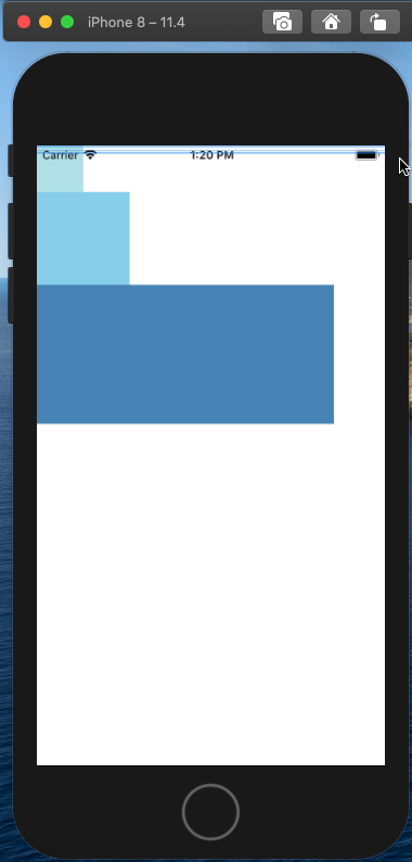
我们知道在css中,一个div如果不设置宽度,默认会占用100%的宽度;在RN中,View和div的性质是一样的,我们可以简单验证一下:
1
2
3
4
5
6
7
8
9
10
11
12
13
14
15
16
17
18
19
20
21
22
23
24
25
26
27
28
29
30
31
32
33
34
| const styles = StyleSheet.create({
box: {
height: 40,
backgroundColor: '#333333',
marginTop: 20,
},
});
const Main = ()=> {
return (
<View>
<Text style={{textAlign: 'center'}}>单个元素,不设置宽度</Text>
<View style={styles.box}></View>
<Text style={{textAlign: 'center'}}>
固定宽度的元素上放一个View,不设置宽度
</Text>
<View style={{width: 200}}>
<View style={styles.box}></View>
</View>
<Text style={{textAlign: 'center'}}>
flex的元素上放一个View,不设置宽度
</Text>
<View style={{flexDirection: 'row', marginTop: 20}}>
<View style={{flex: 1}}>
<View style={{height: 40, backgroundColor: '#333333'}} />
</View>
<View style={{flex: 1}}>
<View style={{height: 40, backgroundColor: '#666666'}} />
</View>
</View>
</View>
)
}
|
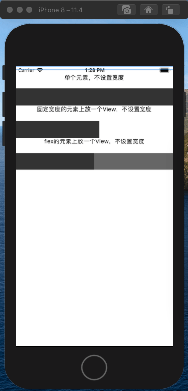
通过上面的效果,我们发现View默认会百分百的占满整个父容器。
在RN中所有的文本内容需要用Text标签包裹,不能直接用View标签。
单位自适应
在上面的样式中,我们发现数值后面是没有单位的(默认单位是dp),表示的是与设备像素密度无关的逻辑像素点;dp是一种相对长度单位,1dp在不一样的屏幕或者不一样的ppi下展现出来的“物理长度”可能不一致,主要是由于ios端和安卓端尺寸单位的不同。
因此我们不能使用dp单位来实现自适应效果;回想一下我们在移动端,通常会使用lib-flexible方案来实现屏幕尺寸的自适应,RN中也是类似的逻辑。
通常UI给出的默认640或者750的设计稿,我们可以通过Dimensions,可以获取到整个设备屏幕的dp尺寸,然后再自定义一个转换函数,将我们的dp单位等比例放大到设备上:
| import {Dimensions} from 'react-native';
const deviceWidthDp = Dimensions.get('window').width;
const uiWidthPx = 640;
function pxToDp(uiElementPx) {
return (uiElementPx * deviceWidthDp) / uiWidthPx;
}
export default pxToDp;
|
调用时直接将样式中单位传入函数进行转换一下:
| import pxToDp from './pxToDp';
const styles = StyleSheet.create({
box1: {width: pxToDp(50), height: pxToDp(50)},
box2: {width: pxToDp(100), height: pxToDp(100)},
box3: {width: pxToDp(150), height: pxToDp(150)},
});
|
布局
和原生的iOS以及Android的开发方式不同,RN的布局采用了Web端布局所常用的Flex布局。这个模型的特点在于能够在按照固定尺寸布局之后,灵活地分配屏幕上的剩余空间,利用这个模型可以轻松实现许多应用中所需要的布局设计。
掌握了Flex布局即可随心所欲地对屏幕上的组件元素进行布局,再结合RN所提供的获取屏幕信息、平台信息等API,就可以进阶实现响应式布局。
Flex布局
Flex弹性盒模型相信很多前端小伙伴都比较熟悉它,我们先来看下在web上和RN中的flex布局有哪些异同。
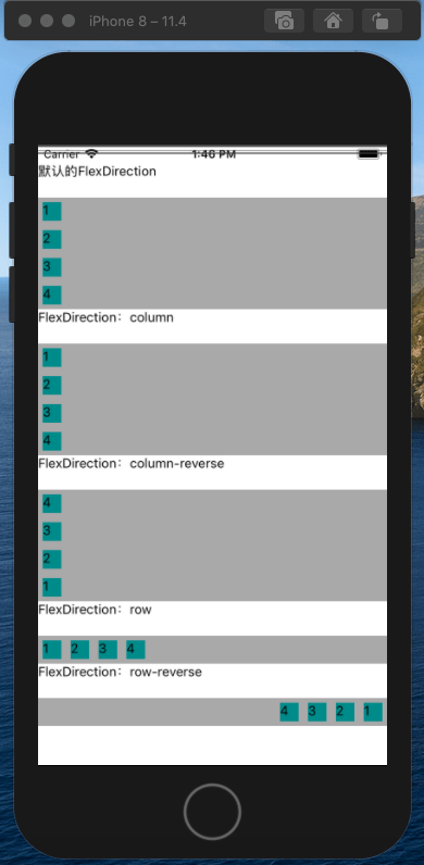
- flexDirection: RN中默认为
flexDirection:'column',在Web中默认为flex-direction:’row’
- alignItems: RN中默认为
alignItems:'stretch',在Web中默认align-items:’flex-start’
- flex: 相比Web的flex接受多参数,如:flex: 2 2 10%;,但在RN中flex只接受一个参数
- 不支持属性:order,flex-flow
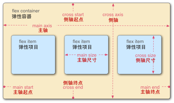
我们来看下Flex的概念:主轴和侧轴:
1
2
3
4
5
6
7
8
9
10
11
12
13
14
15
16
17
18
19
20
21
22
23
24
25
26
27
28
29
30
31
32
33
34
35
36
37
38
39
40
41
42
43
44
45
46
47
48
49
50
51
| const styles = StyleSheet.create({
flexBox: {
display: 'flex',
backgroundColor: 'darkgray',
marginTop: 20,
},
flexItem: {
width: 20,
height: 20,
backgroundColor: 'darkcyan',
margin: 5,
},
});
const FlexBox = () => {
return (
<View>
<Text>默认的FlexDirection</Text>
<View style={styles.flexBox}>
<View style={styles.flexItem}>
<Text>1</Text>
</View>
<View style={styles.flexItem}>
<Text>2</Text>
</View>
<View style={styles.flexItem}>
<Text>3</Text>
</View>
<View style={styles.flexItem}>
<Text>4</Text>
</View>
</View>
<Text>FlexDirection:column</Text>
<View style={[styles.flexBox, {flexDirection: 'column'}]}>
// ...
</View>
<Text>FlexDirection:column-reverse</Text>
<View style={[styles.flexBox, {flexDirection: 'column-reverse'}]}>
// ...
</View>
<Text>FlexDirection:row</Text>
<View style={[styles.flexBox, {flexDirection: 'row'}]}>
// ...
</View>
<Text>FlexDirection:row-reverse</Text>
<View style={[styles.flexBox, {flexDirection: 'row-reverse'}]}>
// ...
</View>
</View>
);
}
}
|
我们看到在RN中flex-direction中的四个属性和Web中表现是一致的,只不过默认是column。
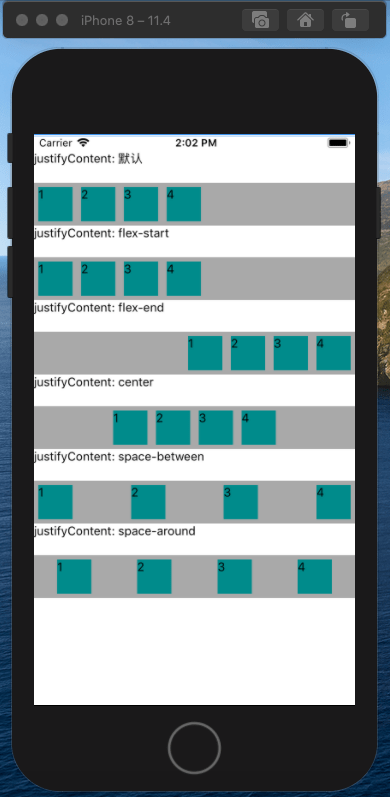
justifyContent属性定义了浏览器如何分配顺着父容器主轴的弹性(flex)元素之间及其周围的空间,默认为flex-start。
1
2
3
4
5
6
7
8
9
10
11
12
13
14
15
16
17
18
19
20
21
22
23
24
25
26
27
28
29
30
31
32
33
34
35
36
37
38
39
40
41
42
43
44
| const styles = StyleSheet.create({
flexBox: {
display: 'flex',
backgroundColor: 'darkgray',
marginTop: 20,
flexDirection: 'row',
},
flexItem: {
width: 40,
height: 40,
backgroundColor: 'darkcyan',
margin: 5,
},
});
const FlexBox = () => {
return (
<View>
<Text>justifyContent: 默认</Text>
<View style={[styles.flexBox]}>
// ...
</View>
<Text>justifyContent: flex-start</Text>
<View style={[styles.flexBox, {justifyContent: 'flex-start'}]}>
// ...
</View>
<Text>justifyContent: flex-end</Text>
<View style={[styles.flexBox, {justifyContent: 'flex-end'}]}>
// ...
</View>
<Text>justifyContent: center</Text>
<View style={[styles.flexBox, {justifyContent: 'center'}]}>
// ...
</View>
<Text>justifyContent: space-between</Text>
<View style={[styles.flexBox, {justifyContent: 'space-between'}]}>
// ...
</View>
<Text>justifyContent: space-around</Text>
<View style={[styles.flexBox, {justifyContent: 'space-around'}]}>
// ...
</View>
</View>
);
};
|
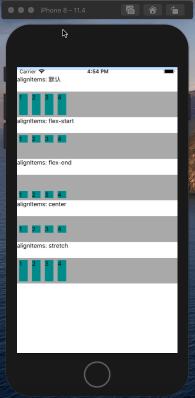
alignItems属性以与justify-content相同的方式在侧轴方向上将当前行上的弹性元素对齐,默认为stretch。
1
2
3
4
5
6
7
8
9
10
11
12
13
14
15
16
17
18
19
20
21
22
23
24
25
26
27
28
29
30
31
32
33
34
35
36
| const styles = StyleSheet.create({
flexBox: {
height: 60,
display: 'flex',
backgroundColor: 'darkgray',
marginTop: 20,
flexDirection: 'row',
},
flexItem: {
width: 20,
backgroundColor: 'darkcyan',
margin: 5,
},
});
const FlexBox = () => {
return (
<View>
<Text>alignItems: flex-start</Text>
<View style={[styles.flexBox, {alignItems: 'flex-start'}]}>
// ...
</View>
<Text>alignItems: flex-end</Text>
<View style={[styles.flexBox, {alignItems: 'flex-end'}]}>
// ...
</View>
<Text>alignItems: center</Text>
<View style={[styles.flexBox, {alignItems: 'center'}]}>
// ...
</View>
<Text>alignItems: stretch</Text>
<View style={[styles.flexBox, {alignItems: 'stretch'}]}>
// ...
</View>
</View>
);
};
|
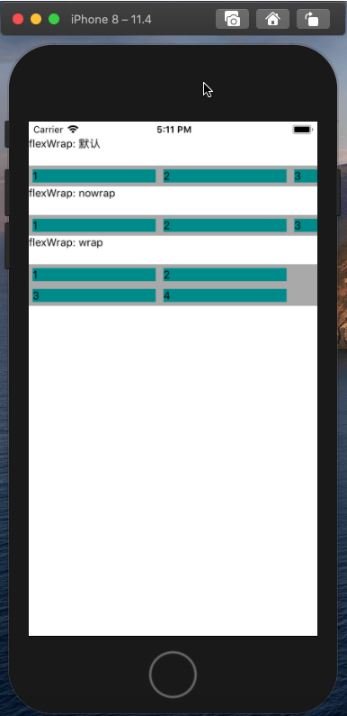
flexWrap属性定义了子元素在父视图内是否允许多行排列,默认为nowrap。
1
2
3
4
5
6
7
8
9
10
11
12
13
14
15
16
17
18
19
20
21
22
23
24
25
26
27
28
29
30
31
| const styles = StyleSheet.create({
flexBox: {
display: 'flex',
backgroundColor: 'darkgray',
marginTop: 20,
flexDirection: 'row',
},
flexItem: {
width: 160,
backgroundColor: 'darkcyan',
margin: 5,
},
});
const FlexBox3 = () => {
return (
<View>
<Text>flexWrap: 默认</Text>
<View style={[box3Style.flexBox]}>
// ...
</View>
<Text>flexWrap: nowrap</Text>
<View style={[box3Style.flexBox, {flexWrap: 'nowrap'}]}>
// ...
</View>
<Text>flexWrap: wrap</Text>
<View style={[box3Style.flexBox, {flexWrap: 'wrap'}]}>
// ...
</View>
</View>
);
};
|
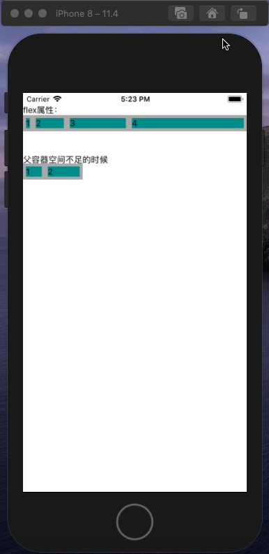
flex属性定义了一个可伸缩元素的能力,默认为0。
1
2
3
4
5
6
7
8
9
10
11
12
13
14
15
16
17
18
19
20
21
22
23
24
25
26
27
28
29
30
31
32
33
34
35
36
37
38
39
40
| const styles = StyleSheet.create({
flexBox: {
flexDirection: 'row',
backgroundColor: 'darkgray',
},
flexItem: {
backgroundColor: 'darkcyan',
margin: 5,
},
});
const FlexBox = () => {
return (
<View>
<Text>flex属性:</Text>
<View style={[styles.flexBox]}>
<View style={[styles.flexItem, {flex: 0}]}>
<Text>1</Text>
</View>
<View style={[styles.flexItem, {flex: 1}]}>
<Text>2</Text>
</View>
<View style={[styles.flexItem, {flex: 2}]}>
<Text>3</Text>
</View>
<View style={[styles.flexItem, {flex: 4}]}>
<Text>4</Text>
</View>
</View>
<Text>父容器空间不足的时候</Text>
<View style={[styles.flexBox, {width: 100}]}>
<View style={[styles.flexItem, {flex: 1, width: 100}]}>
<Text>1</Text>
</View>
<View style={[styles.flexItem, {flex: 2, width: 200}]}>
<Text>2</Text>
</View>
</View>
</View>
);
};
|
绝对定位和相对定位
RN中还提供了Web中另外两种常见的布局方式:绝对定位和相对定位,不过不支持固定定位(fixed)。
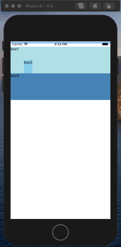
相对定位相对于原来的位置进行了移动,元素设置此属性仍然处理文档流中,不影响其他元素的布局。
1
2
3
4
5
6
7
8
9
10
11
12
13
14
15
16
17
18
19
20
21
22
23
24
25
26
27
28
29
30
31
32
33
| const styles = StyleSheet.create({
boxItem: {
height: 100,
},
box1: {
backgroundColor: 'powderblue',
},
box2: {
backgroundColor: 'skyblue',
position: 'relative',
left: 50,
top: 50,
zIndex: 9,
},
box3: {
backgroundColor: 'steelblue',
},
});
const RelativeLayout = () => {
return (
<View>
<View style={[styles.boxItem, styles.box1]}>
<Text>box1</Text>
</View>
<View style={[styles.boxItem, styles.box2]}>
<Text>box2</Text>
</View>
<View style={[styles.boxItem, styles.box3]}>
<Text>box3</Text>
</View>
</View>
);
};
|
相对定位的效果:
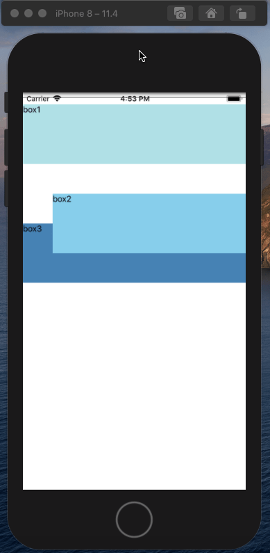
绝对定位的元素相对于父容器进行位置定位,当父容器没有设置相对定位或绝对定位时,元素会相对于根元素定位;绝对定位的元素会脱离文档流,影响到其他元素的定位:
1
2
3
4
5
6
7
8
9
10
11
12
13
14
15
16
17
18
19
20
21
22
23
24
25
26
27
28
29
30
31
32
33
34
35
36
| const styles = StyleSheet.create({
container: {
position: 'relative',
},
boxItem: {
height: 100,
},
box1: {
backgroundColor: 'powderblue',
},
box2: {
backgroundColor: 'skyblue',
position: 'absolute',
left: 50,
top: 50,
},
box3: {
backgroundColor: 'steelblue',
},
});
const AbsolueteLayout = () => {
return (
<View style={styles.container}>
<View style={[styles.boxItem, styles.box1]}>
<Text>box1</Text>
</View>
<View style={[styles.boxItem, styles.box2]}>
<Text>box2</Text>
</View>
<View style={[styles.boxItem, styles.box3]}>
<Text>box3</Text>
</View>
</View>
);
};
|
绝对定位的效果:
图片资源
同Web中的img标签一样,RN中也提供了Image组件用来显示各种图片资源,它可以展示三种图片资源:
- 加载本地磁盘上的图片
- 网络请求的图片
- base64格式的图片
我们来看下每种方式如何加载图片:
1
2
3
4
5
6
7
8
9
10
11
12
13
14
15
16
17
18
19
20
| import {
Image,
} from 'react-native';
const Home = () => {
return (
<View>
<Image
source={require('./logo.jpg')}
style={{width: 360, height: 280}}></Image>
<Image
source={{ uri: 'https://xieyufei.com/img/bg_small.jpg' }}
style={{width:1024, height: 640}}></Image>
<Image
source={{
uri: 'data:image/png;base64,iVBORw0KGgoAAAANSUhEUgAAABoAAAAZCAMAAAAYAM5SAAAA4VBMVEVHcEz'
}}
style={{width: 30, height: 30}}></Image>
</View>
)
}
|
Image组件必须在样式中声明图片的宽和高;如果没有声明,则图片将不会被呈现在界面上。
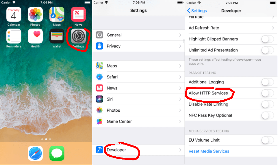
在iOS平台,从iOS9开始引入了新特性App Transport Security (ATS),要求App内访问的网络必须使用HTTPS协议,因此只能加载https协议的图片和接口;我们可以在模拟器中进行设置,开启http服务:
RN默认支持jpg和png格式的图片,在iOS平台下,还支持GIF、WebP格式;在Android平台下,默认不支持GIF、WebP格式。可以通过修改Android工程设置让其支持这两种格式:
| dependencies {
compile 'com.facebook.fresco:animated-gif:0.11.0'
compile 'com.facebook.fresco:webpsupport:0.11.0'
compile 'com.facebook.fresco:animated-webp:0.11.0'
}
|
组件静态方法
Image组件提供了一个静态函数getSize,用来取得指定URI地址图片的宽和高(单位为像素)。在调用getSize函数取图片的宽、高时,RN事实上会下载这张图片,并且将该图片保存到缓存中;因此getSize函数也可以作为预加载图片资源的一个方法。
| Image.getSize(
'https://xieyufei.com/img/bg_small.jpg',
(width, height) => {
console.log(width, height, 'image size');
},
error => {
console.log(error);
},
);
|
我们也可以使用 Image 组件的静态函数prefetch来预下载某张网络图片。
| Image.prefetch(
'https://xieyufei.com/img/bg_small.jpg',
res => {
console.log('prefetch', res);
},
);
|
图片显示模式
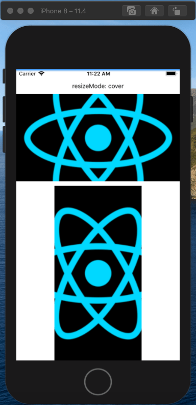
当Image组件的实际宽、高与图片的实际宽、高不符时,要如何显示图片由样式定义中的resizeMode取值来决定;resizeMode可取的五个值分别是:contain、cover、stretch、center和repeat,每种模式的效果如下。
cover模式(默认值),该模式要求图片能够填充整个Image组件定义的显示区域,可以对图片进行放大或者缩小,可以丢弃放大或缩小后的图片中的部分区域,只求在显示比例不失真的情况下填充整个显示区域。
1
2
3
4
5
6
7
8
9
10
11
12
13
14
15
16
17
18
19
20
21
| <View>
<Text>resizeMode: cover</Text>
<View>
<Image
source={require('./logo.png')}
style={{
resizeMode: 'cover',
height: 200,
width: 400,
}}></Image>
</View>
<View>
<Image
source={require('./logo.png')}
style={{
resizeMode: 'cover',
height: 400,
width: 200,
}}></Image>
</View>
</View>
|
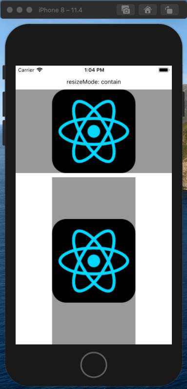
contain模式要求显示整张图片,可以对它进行等比放大或者缩小,但不能丢弃改变后图片的某部分。这个模式下图片得到完整的呈现,比例不会变。但图片可能无法填充Image的所有区域,会在侧边或者上下留下空白,由Image组件的底色填充。
1
2
3
4
5
6
7
8
9
10
11
12
13
14
15
16
17
18
19
20
21
22
23
| <View>
<Text>resizeMode: contain</Text>
<View>
<Image
source={require('./logo1.png')}
style={{
resizeMode: 'contain',
height: 200,
width: 400,
backgroundColor: '#999',
}}></Image>
</View>
<View>
<Image
source={require('./logo1.png')}
style={{
resizeMode: 'contain',
height: 400,
width: 200,
backgroundColor: '#999',
}}></Image>
</View>
</View>
|
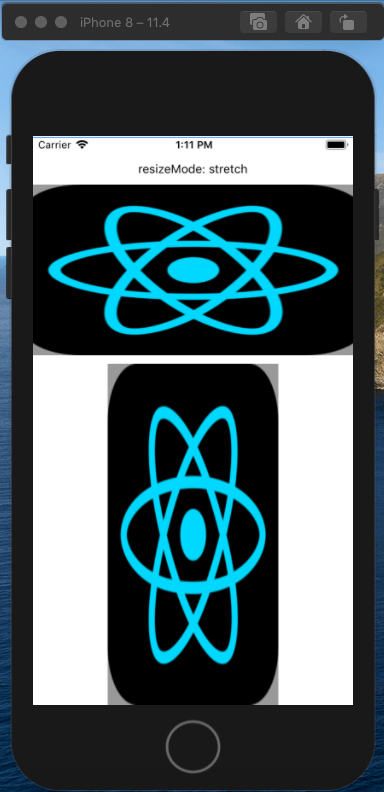
stretch模式要求图片填充整个Image定义的显示区域,因此会对图片进行任意的缩放,不考虑保持图片原来的宽、高比。这种模式显示出来的图片有可能会出现明显的失真。
1
2
3
4
5
6
7
8
9
10
11
12
13
14
15
16
17
18
19
20
21
22
23
| <View>
<Text>resizeMode: stretch</Text>
<View>
<Image
source={require('./logo1.png')}
style={{
resizeMode: 'stretch',
height: 200,
width: 400,
backgroundColor: '#999',
}}></Image>
</View>
<View>
<Image
source={require('./logo1.png')}
style={{
resizeMode: 'stretch',
height: 400,
width: 200,
backgroundColor: '#999',
}}></Image>
</View>
</View>
|
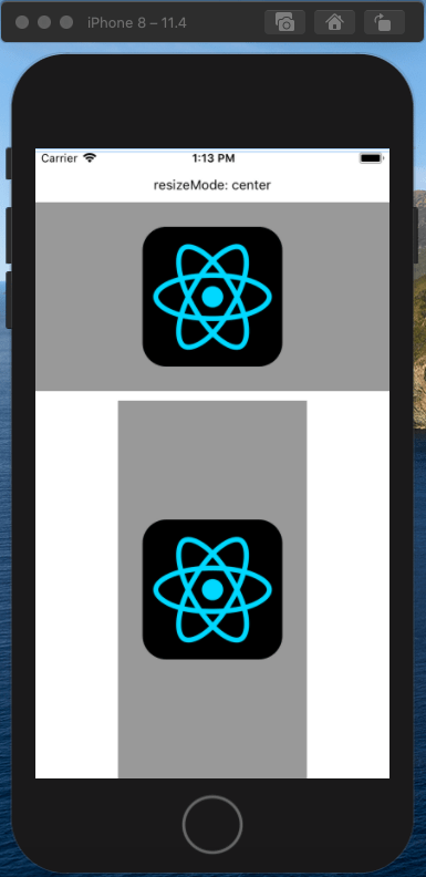
center模式要求图片图片位于显示区域的中心。这种模式下图片可能也无法填充Image的所有区域,会在侧边或者上下留下空白,由Image组件的底色填充。
1
2
3
4
5
6
7
8
9
10
11
12
13
14
15
16
17
18
19
20
21
22
23
| <View>
<Text>resizeMode: stretch</Text>
<View>
<Image
source={require('./logo1.png')}
style={{
resizeMode: 'stretch',
height: 200,
width: 400,
backgroundColor: '#999',
}}></Image>
</View>
<View>
<Image
source={require('./logo1.png')}
style={{
resizeMode: 'stretch',
height: 400,
width: 200,
backgroundColor: '#999',
}}></Image>
</View>
</View>
|
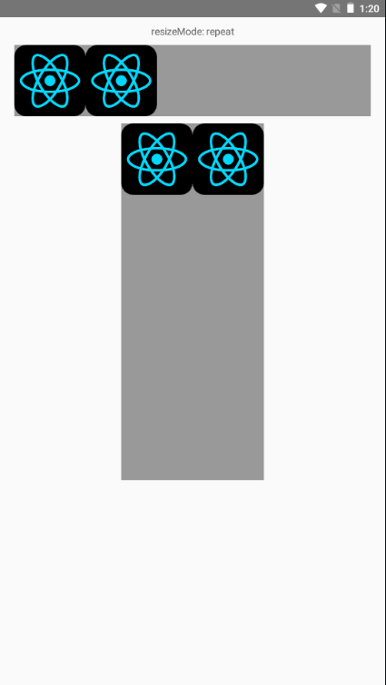
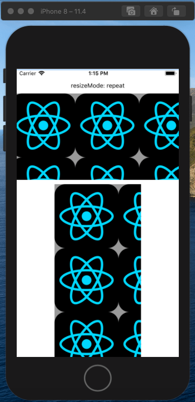
repeat模式的图片处理思路是用一张或者多张图片来填充整个Image定义的显示区域。
1
2
3
4
5
6
7
8
9
10
11
12
13
14
15
16
17
18
19
20
21
22
23
| <View>
<Text>resizeMode: repeat</Text>
<View>
<Image
source={require('./logo1.png')}
style={{
resizeMode: 'repeat',
height: 200,
width: 400,
backgroundColor: '#999',
}}></Image>
</View>
<View>
<Image
source={require('./logo1.png')}
style={{
resizeMode: 'repeat',
height: 400,
width: 200,
backgroundColor: '#999',
}}></Image>
</View>
</View>
|
不过该模式在iOS和安卓下表现形式不一样,在iOS下会向X轴和Y轴方向重复填充:
安卓下repeat则只会在X轴方向重复填充两个图片: